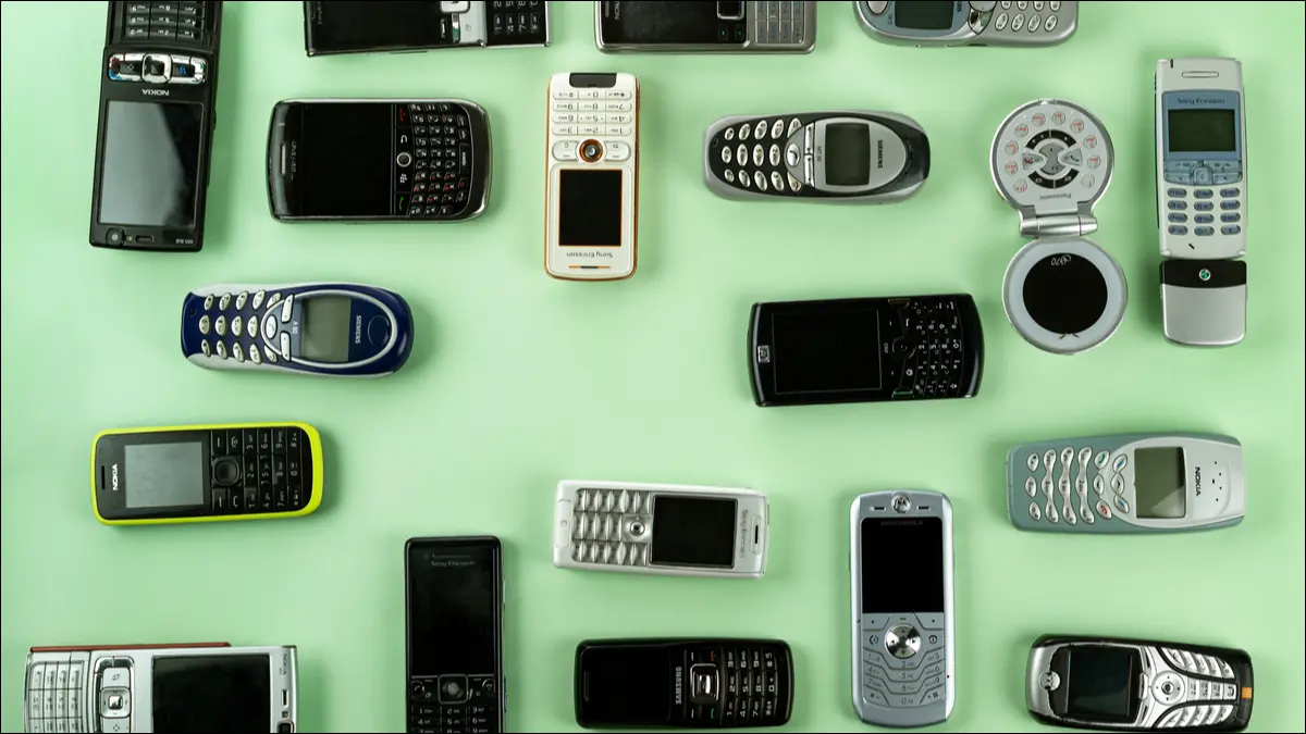

Modern phones have mostly converged into basic shapes with common materials. It hasn’t always been this way, though. There have been some truly strange design and function decisions over the years. Let’s take a look at some of the weirdest.
Like in our list of the ugliest phones of all time, many of the phones in this list are pretty old. The beginning of the mobile phone era saw companies taking a lot of risks and everyone was trying to figure out what people wanted. That led to some big hits and some major “what were they thinking?” moments. Enjoy.
Microsoft Kin

“Bizarre” doesn’t always mean “bad,” but it also doesn’t mean the device was a success. The Microsoft Kin was a strange device with some very interesting ideas. Ultimately, it didn’t sell very well, but it was certainly bizarre.
The Kin was launched at a weird time. It was right before Microsoft decided to go all-in with Windows Phone 7. The user interface on the Kin has similar vibes to what would eventually become Windows Phone, but this wasn’t a smartphone. It was a very small—and cute—feature phone with a slide-out keyboard.
Sadly, the cute-ness didn’t matter. The Kin—which was actually several different models—was basically dead on arrival.
Motorola Backflip

There are a lot of ways to put a physical keyboard on a phone. You can flip it, slide it, and even swivel it. Motorola took the flipping concept and used it in a very strange way, with the keyboard on the back of the phone.
A typical flip phone has the keyboard fold to meet the screen, both protected inside when closed. The Motorola Backflip had the keyboard behind the display and you would flip it forward to have the keyboard underneath the display.
I think there’s a reason why no other phone has done this. Why have the keyboard out all the time like that? It’s never protected and your hands are always touching it when you hold the phone. Motorola’s Flipout was a better idea.
Yotaphone

Some bizarre ideas are actually good ideas. The Yotaphone attempted to solve a problem in a very unique way. LCD and LED displays eat up a lot of battery. What if you have a low-power display that you could use for simple tasks?
The Yotaphone had two displays: On the front, a typical full-color smartphone display on the front. On the back, an e-ink display like you’d find on a Kindle or other eReader. The idea was you could save power by using the e-ink display. It was actually a pretty cool idea, but it never really caught on.
Toshiba G450

Toshiba
You’re looking at the photo of the Toshiba phone above. I probably don’t need to tell you why this is a bizarre phone, but I will anyway. What’s going on here?
The number buttons and display are spread out across three round sections and the entire device is the shape of a contacts case. It’s an incredibly strange-looking phone. I’m sure it’s very comfortable to hold, but it just looks weird. Futuristic in a bad way.
Siemens Xelibri 6

Seimens had a whole line of phones under the “Xelibri” brand in 2004. The most bizarre of the bunch was the Xelebri 6. Imagine making a phone out of a makeup compact. That’s exactly what this phone is.
It opens with a literal mirror on one side, with a small display in the middle. The number buttons were spread out in an array around the center of the bottom. And on top of it all is the tiny navigation pad and bold gold color.
Of all the phones on this list, the Siemens Xelibri 6 is the most bizarre because it was basically designed to be that way. Some phones end up being weird on accident, but Seimens was specifically doing for something very different, and it succeeded.


